MIB EHR Portal
Fast search and retrieval of Electronic Medical Records
1 | 13

Client
MIB Group, Braintree, Mass.
My Role
- Design Lead
- Stakeholder Interviews
- Discovery Sessions
- Information Architecture
- Visual Design
- Typography
- Prototypes
- User Testing
- Design System
- Documentation
- User Stories and Jira
- Developer
- HTML
- CSS
- JavaScript
How might we …
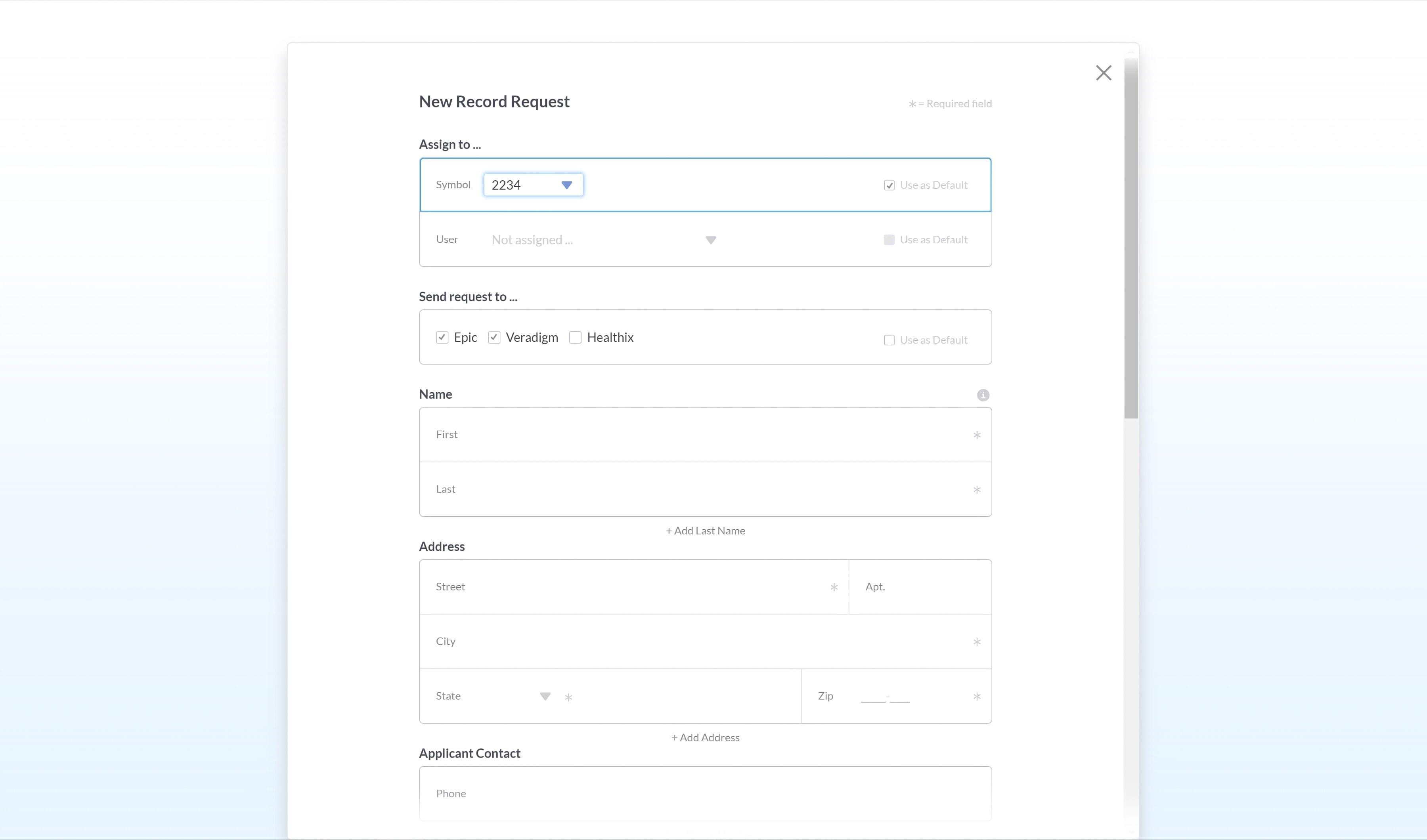
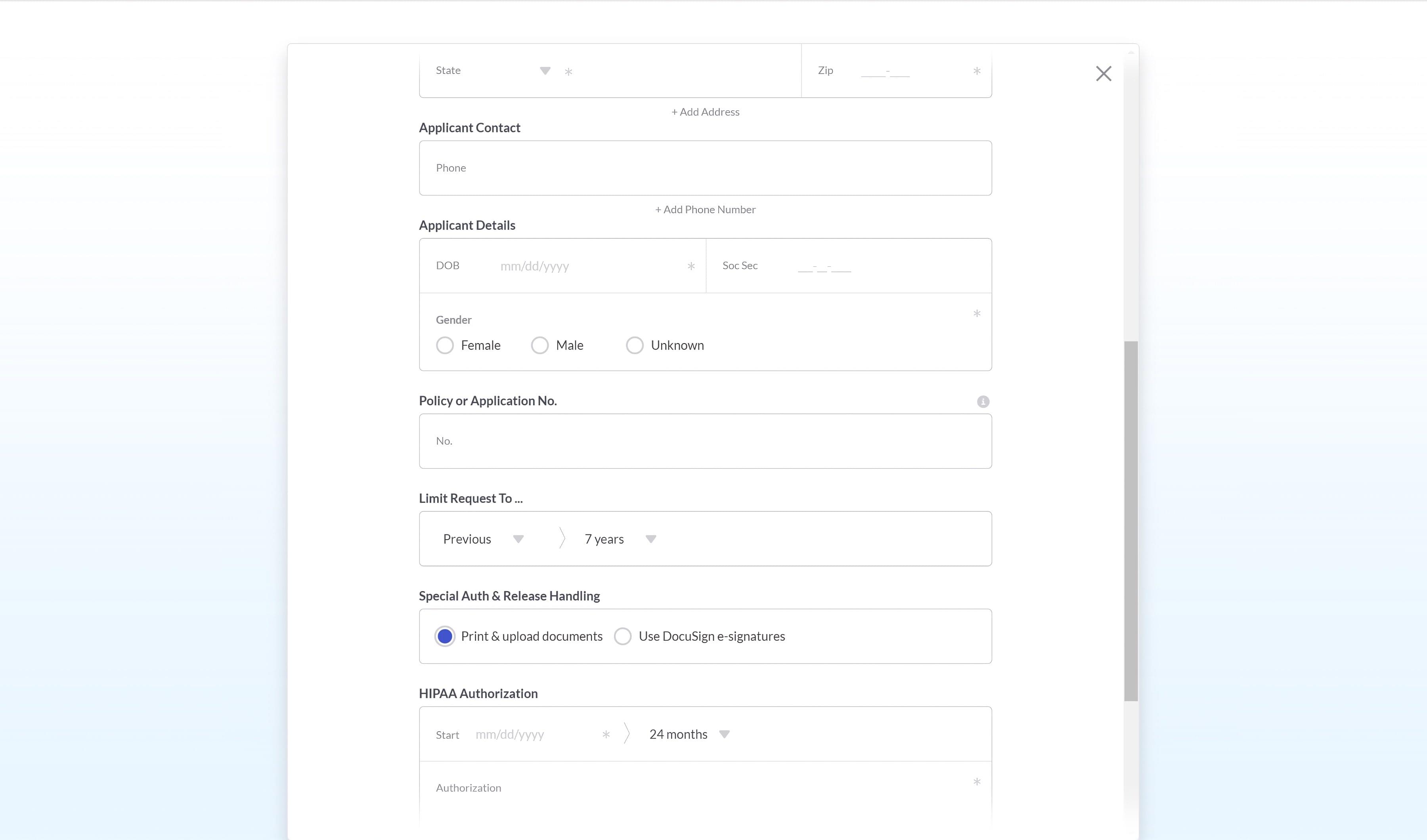
- Allow a user to request medical records held by multiple providers all around the country with a single records search
- Reduce delivery time of records to a few days or even hours rather than the weeks or months it normally takes
- Greatly reduce costs of medical records searches
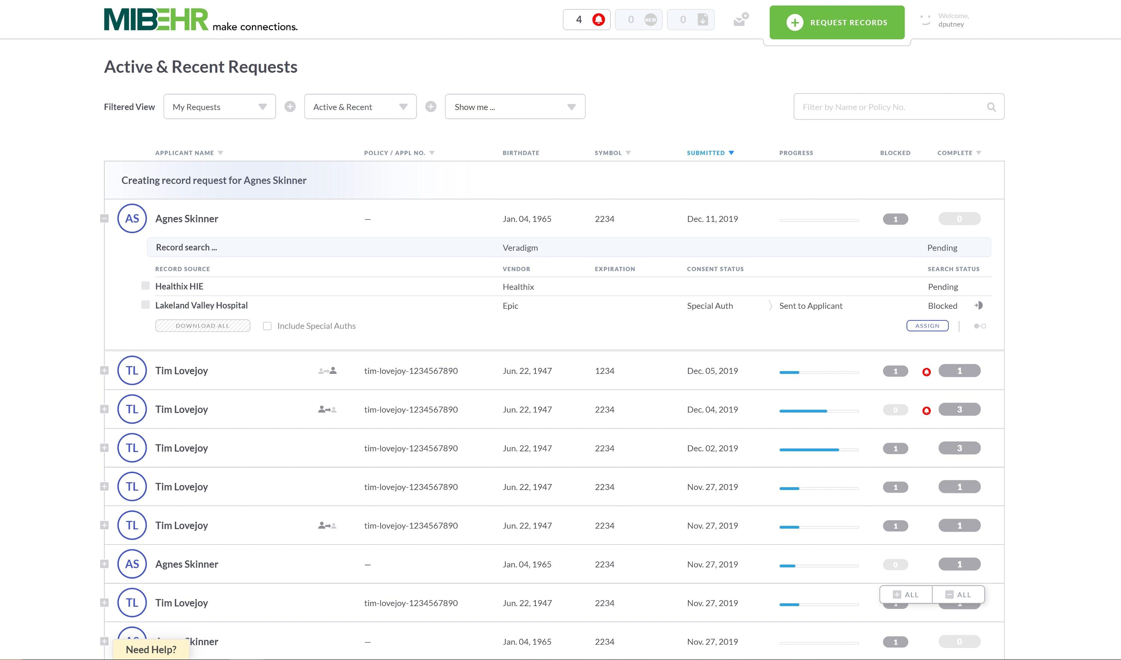
- Combine the results of multiple records sources into a single, simple interface
Unique Challenges
No. 1 | Bringing multiple, disparate data sources together into a single, simple experience
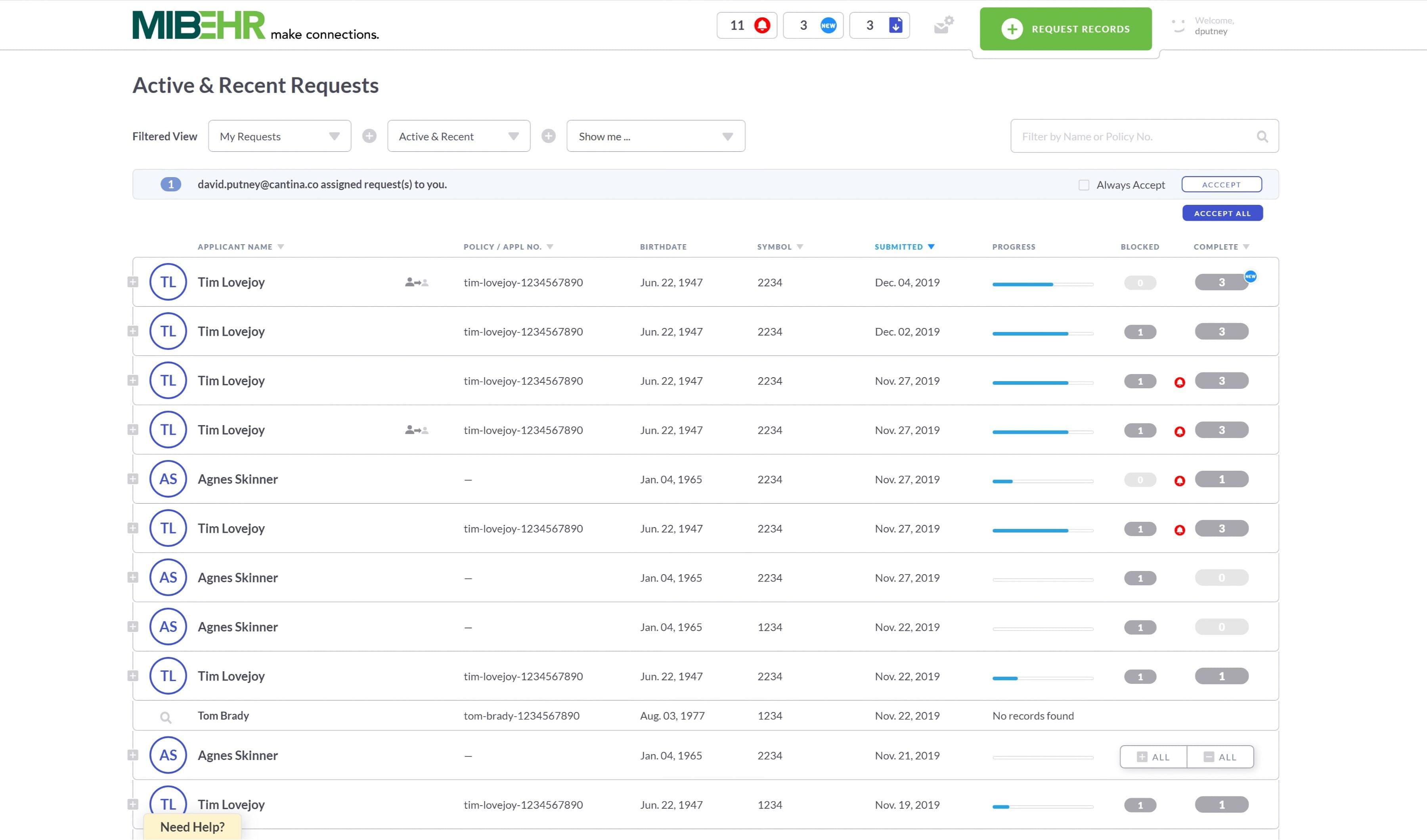
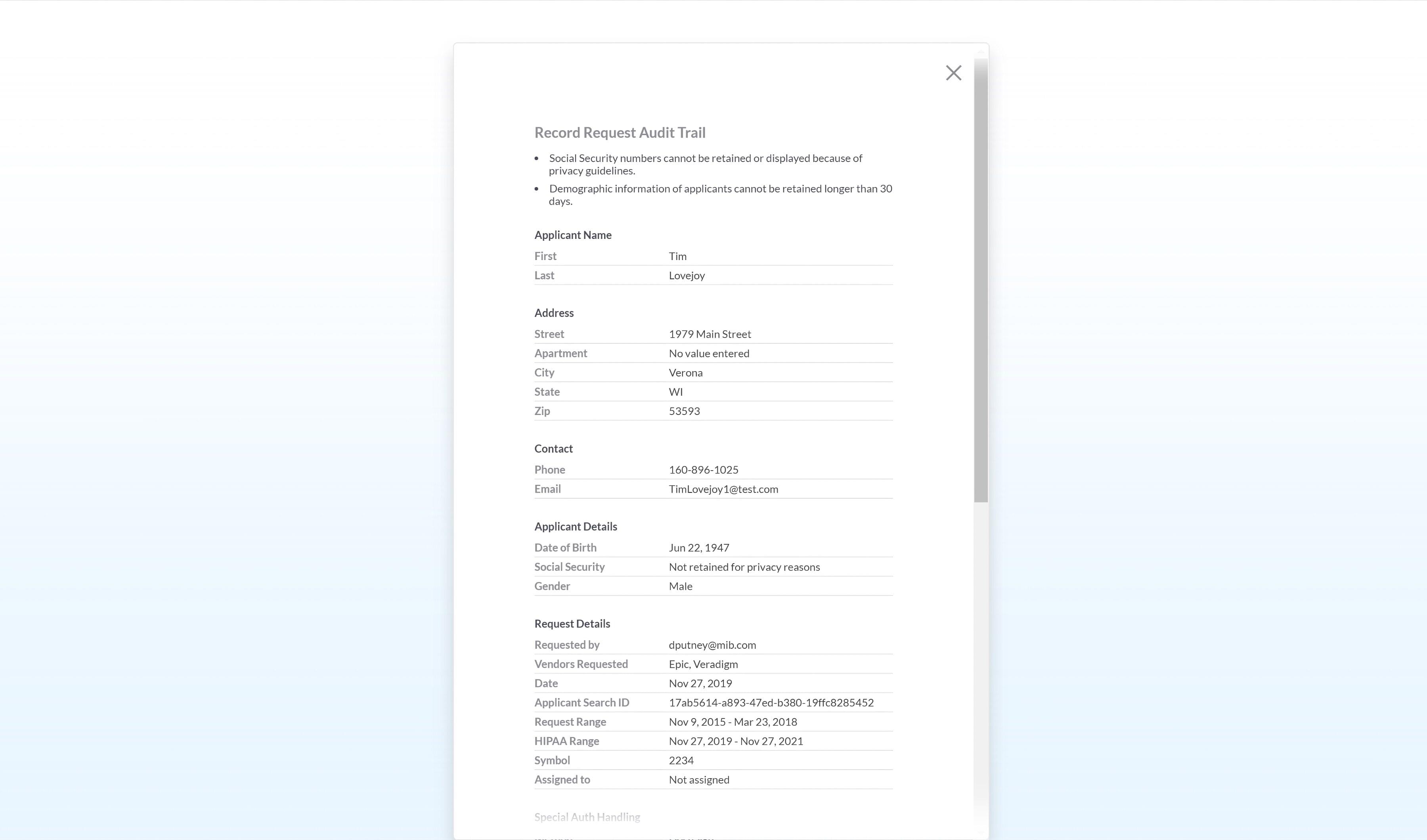
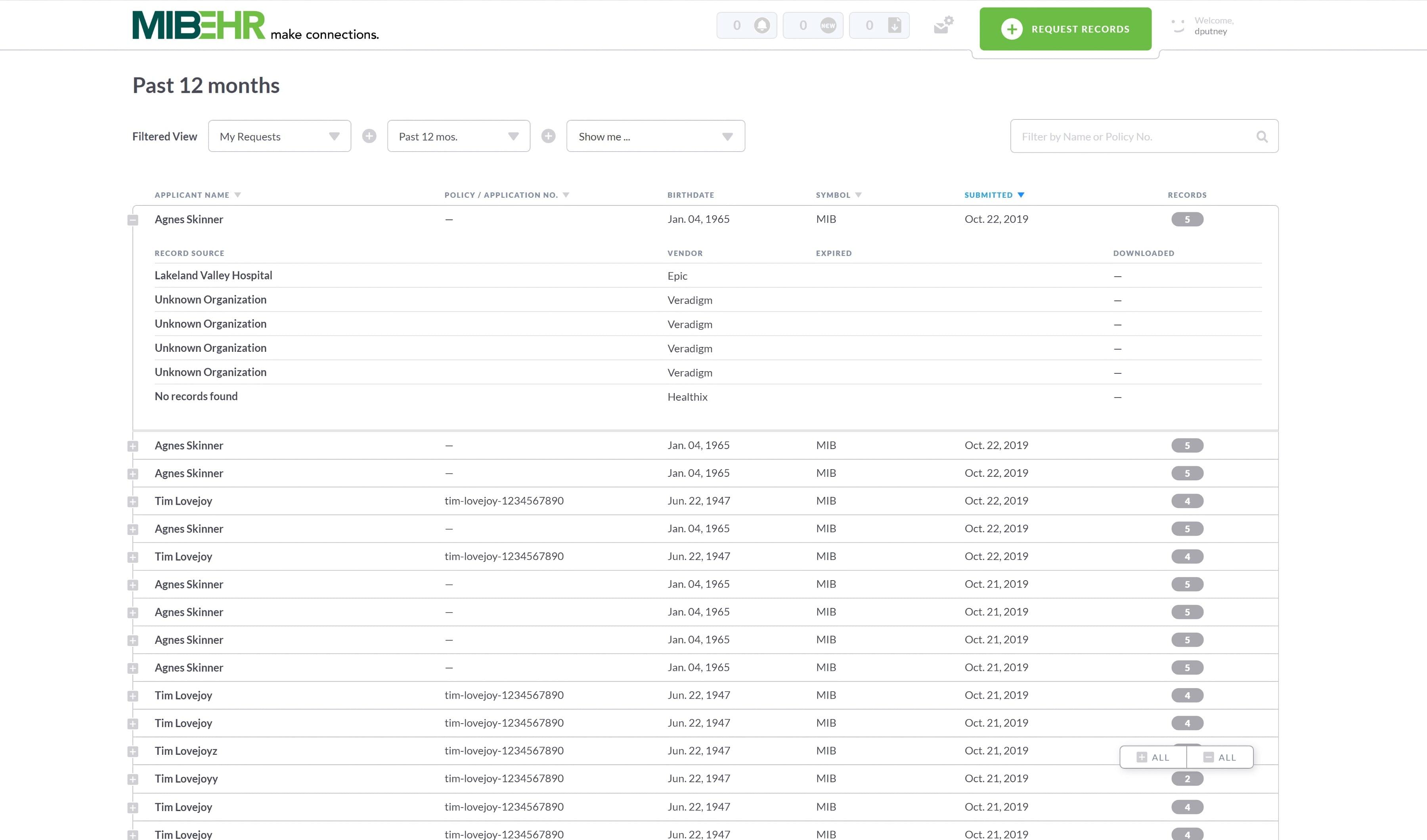
MIB-EHR would hit APIs from multiple record providers simultaneously and aggregate results. Each provider had its own way of doing things. Response latency varied from immediate to several days. All required slightly different demographic data to start a search and returned different status data. Some required documents be signed and submitted to complete a release.
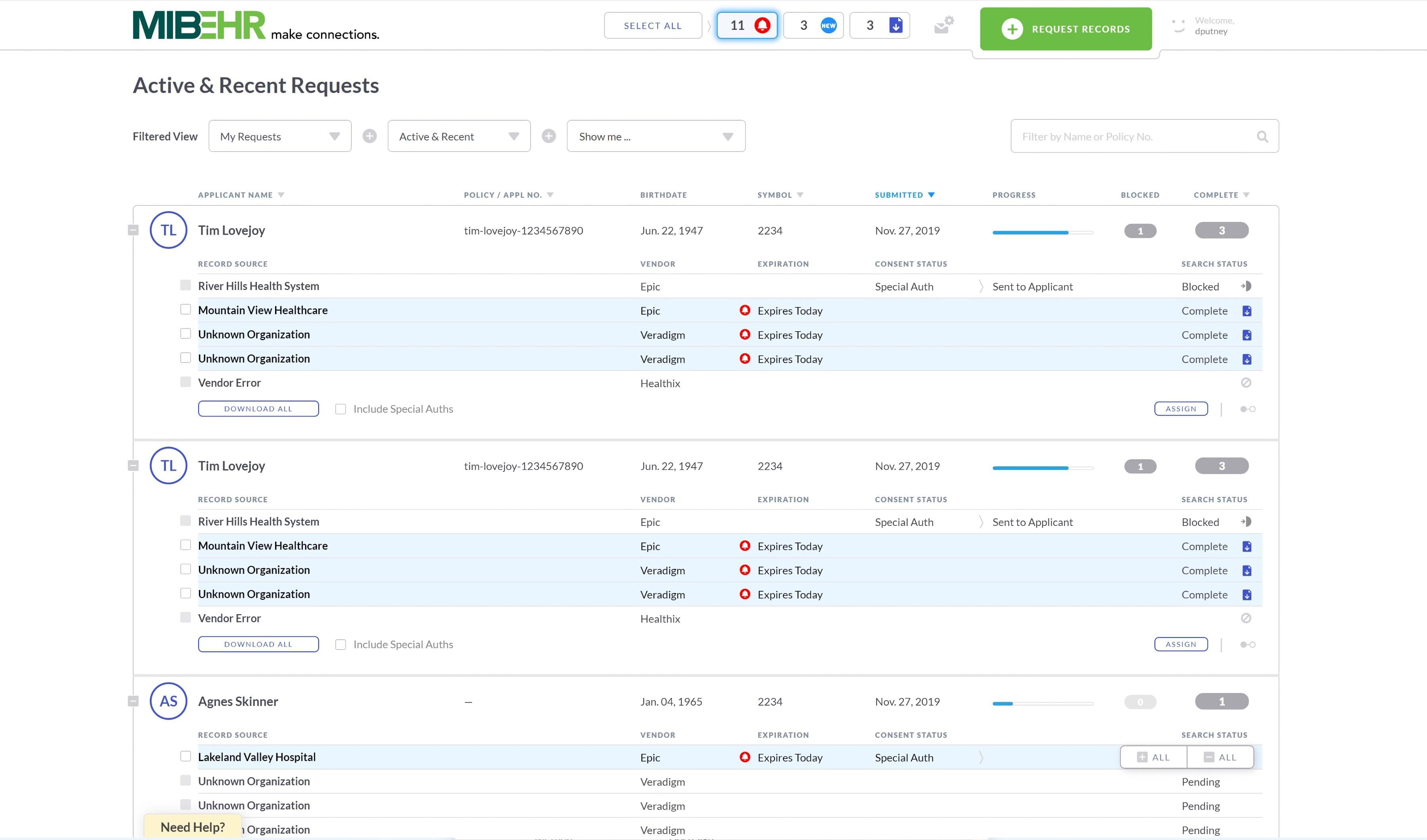
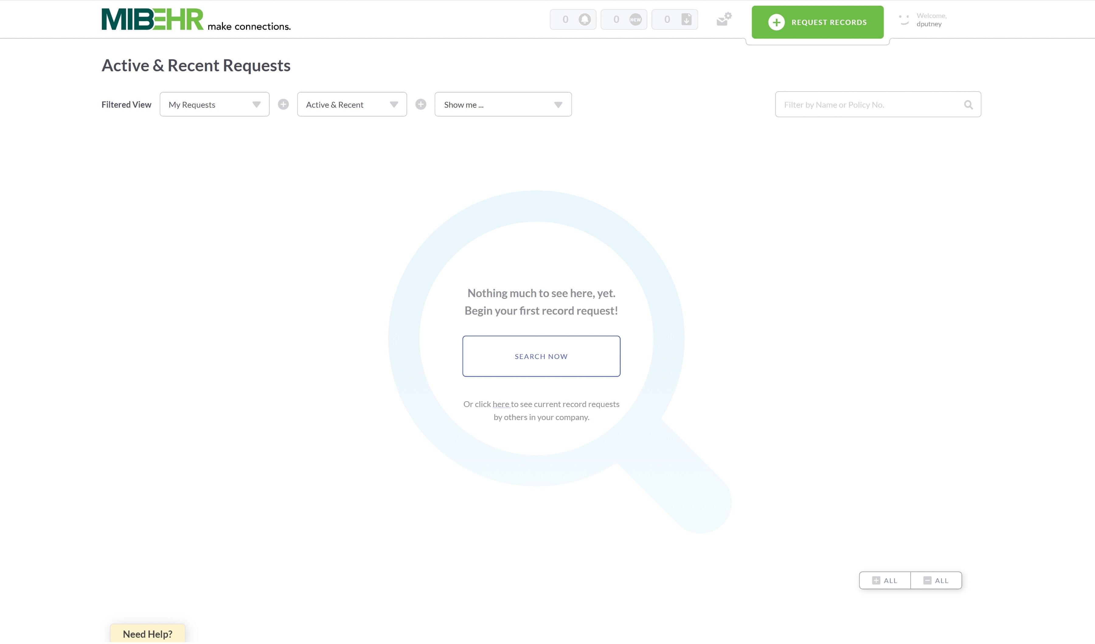
The experience and UI needed to normalize and hide this chaos to present a single experience – a life cycle of a document request on our platform regardless of source. The UI would keep the user clearly informed at every step, alert them to any steps they needed to take to advance a request and warn them of any problems.
Life cycle:
- Draft
- Submitted, awaiting response
- Response, but additional documents needed
- Pending record release
- Complete, records released and ready for download
- Record download about to expire
- Expired
No. 2 | Dual role: Designer and Developer
I was sole designer on a team of eight back-end developers, as well as front-end developer and owner of the CSS and HTML. Juggling these two roles took organization and tolerance of context switching, as well as knowledge of both disciplines.
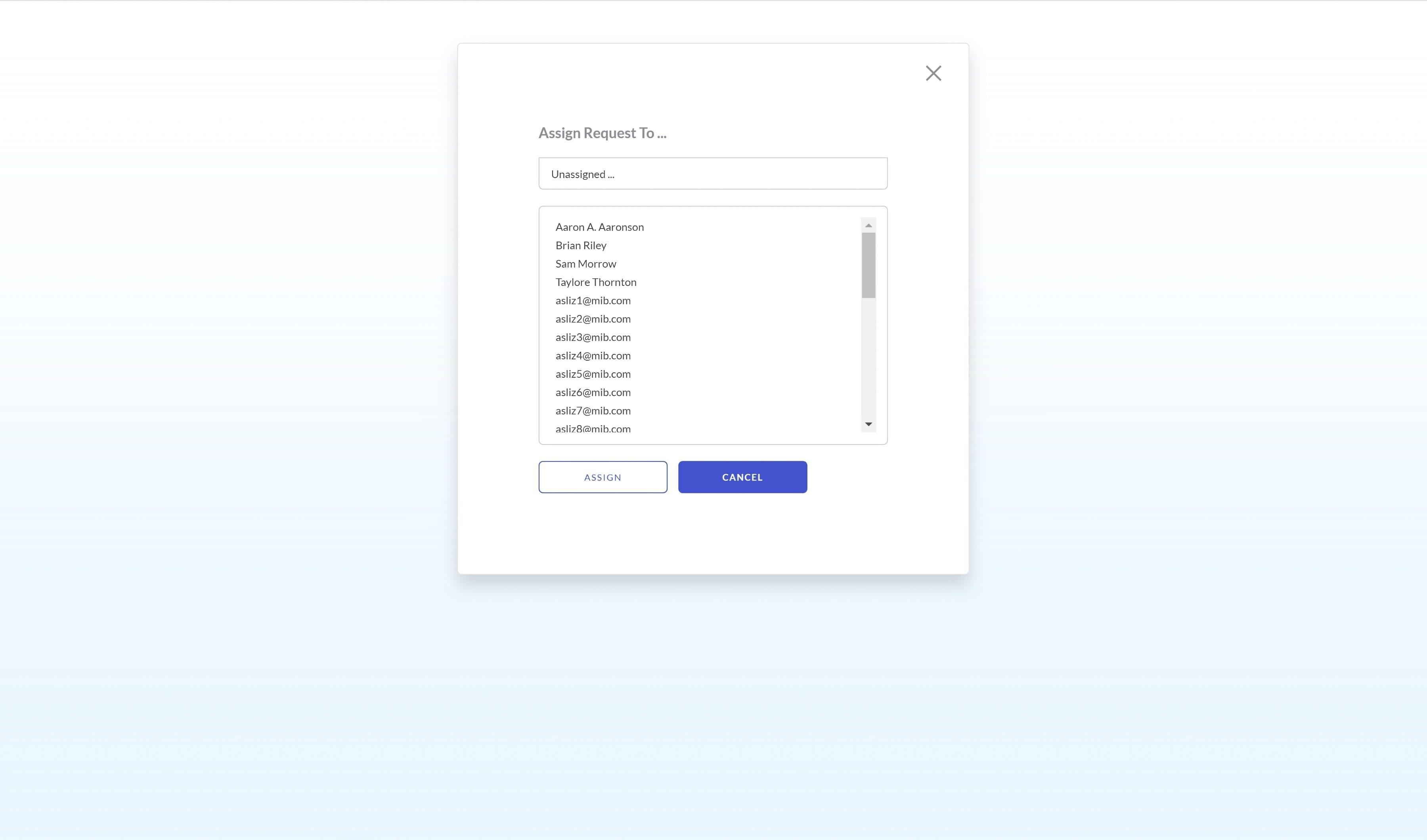
On the design side, I would gather requirements, design, user test, iterate and present. Once approval was gained, I would write the Jira tickets, then see them through the grooming process and into the sprints. The final step was to document features in Confluence.
On the developer side, I joined in sprint ceremonies and was fully involved in the front-end development process – writing code, sending PRs, working with Q/A and participating in sprint demos. My CSS was fully modularized, leveraged SASS mixins, includes and variables. As owner, I regularly refactored and optimized code to be as tidy as possible.
No. 3 | Building a performant and accessible front end
MIB-EHR was a browser-only, desktop focused app that needed to support Internet Explorer 8. This presented a challenge. Animations and transitions needed to be smooth and snappy. Opening a row to reveal multiple items was accomplished with minimal DOM repaint. The front-end code was heavily optimized toward performance.
The UI was fully operable via keyboard only, with a fully tabable interface and keyboard shortcuts for key functions.
No. 4 | Helping a client reinvent themselves
This was a green-field project for a client with long-established software development practices. This would be their first time working with a designer and their first Agile project. We were able to work with customers to quickly design, implement and ship requested features. An executive at MIB told me that “MIB is not known for being a responsive organization,” then added “except for EHR.”