As Flash dies a lingering, welcome death and its larger functions are replaced by native code, developers are finding themselves needing alternatives to smaller things it did too. Among them is Flash-based copy to clipboard.
The JavaScript code to do the copy is quite simple, just a single line. Perhaps that’s why when I went looking for JavaScript copy-to-clipboard tips and methods, I found them mainly limited to Stack Overflow threads and the like. I’ve put cobbled them together insights from several and some of my own testing and some insights into a tutorial of sorts.
I also threw in some other code to improve the overall experience of doing a copy for the end user.
What is being done in the process is fairly straightforward.
Listen for a button click,
Select the form field or item to copy.
Copy the form contents or the item
Test for success
Offer a success or failure message
Reset for another copy process
By breaking it into a step-by-step process, it becomes a much more solvable problem. And this version throws in some UX features that make the overall process better for users.
The first step is the HTML. I’m omitting the CSS, but in this case the markup would need a class that sets the class message to display:none by default and another that set them to display:block on active state. This is the markup for the form and button.
The JavaScript is just one piece of the problem at a time. Add a listener to the button and find the form field with the content on click.
A these lines will set the form field to active, select the contents and place it into a variable. The copy is accomplished using document.execCommand().
Testing this variable as true / false determines whether the copy was successful and shows the user a message with the outcome. Simply adding a success message without this test means the copy could fail silently.
However, a copy process returning an error is also possible, so I’ve included some try / catch code.
The form field needs to be reset back to its default state once the paste is complete so the user can copy again or alter the form text. I’ve used a 2-second delay.
These are the basic steps needed to to a copy to clipboard with success confirmation. I’ve put them all together into a CodePen.
However, these steps can be refactored into a more compact form – 17 lines vs. 45 – and, in this case altered to better fit an implementation – in this case, my own – without changing the basic principles behind what has been described. In my own version, the active state is applied to a div that wraps the form field. Also the function that does the active state set and reset is refactored into a single function that receives the specific pass or fail style as an argument.
In the interest of space I’ve converted my if statements into a ternary operator. This is my finished code as I used on the site I’m building.
This copy-to-clipboard method should work in any browser that supports the feature. Universal support, however, remains a problem.
Safari for both Mac and iOS do not support it for security reasons, but Chrome and Firefox and Internet Explorer are both good with it. No JS method will work for Safari.
This is the time of year when the inequalities of life seem the most profound.
Many of us revel in abundance while others do without. As Bono once so sagely sang “Well tonight thank God it’s them instead of you.” Now don’t you feel guilty?
That is why we are excited to announce our 2015 holiday fund drive to help to bring joy to a troubled world. Davidputney.com and you – actually, we prefer to think of it as us – working together, hand-in-hand can help create a bright spot that can touch the lives of dozens of people every month.
We need your help to fund the purchase of the davidputney.sucks top-level domain.
Owning davidputney.sucks has been a longtime dream of ours,1 and no doubt it is a sentiment shared by anyone who has ever read this site.
No amount that you can give is too small. If only 329.81 people were to give $1 we could hit our goal of $329.81. However, we would actually encourage each of those 329.81 people to give at least $10 so that we could have even more money. If you could swipe a credit card from a loved one and give double that, it would be even better.
Why do a fundraising drive for davidputney.sucks?
We know that $329 doesn’t sound like much money to to a far-reaching internet enterprise such as this one. But, it’s been a tough year financially for Davidputney.com.
Our revenue is up, sure, but our bottom line has taken a serious hit once we figure in executive bonuses, executive pay increases, executive housing stipends, executive travel reimbursements, executive stock options, executive bonuses and the cost of the Pinkerton guards to oversee our layoffs.
Also, we’d just prefer to have someone else pay.
Think of it as something like a Kickstarter project except at the end we keep all the money and you don’t actually get anything. In other words, it’s just like most Kickstarter projects.
So, please, give till it hurts. Give till your eyes bleed. Give.
Other than eating an entire block of Vermont cheddar like an apple.
Would you serve frozen turkey roll heated in a microwave to guests?
No. No, you would not. Proper Thanksgiving tradition calls for a bespoke meal – gravy made from turkey drippings in a cast-iron skillet, stuffing made from toasted and hand-torn bread, a freshly roasted golden-brown bird, and casserole made from canned soup, green beans and fried onions. Well, three out of four ain’t bad.
Yet people buy millions of tons of canned cranberry sauce to serve to guests. This is not only sad but also very, very wrong. We serve beloved family members 1 who have journeyed hours to be with us food the color of a late-stage diabetic’s bloated limb. It slides out of the can and flops into a serving dish like dog food.
It sits there in the bowl in a watery purple puddle still the shape of the container it came in. If there is any food you could serve to your guests that says “I give zero fucks” more than this I’m not sure what it would be. Twinkies? Slim Jims?
Despite all this evidence, often people say that they prefer canned sauce to homemade. Naturally everyone is a little bit different and we must cater to our guests’ wishes and accept that people have their own taste preferences, but people who prefer canned sauce are wrong and stupid.
If I ever come to power among my first acts after calling George Lucas to account for his many crimes would be to outlaw canned cranberry sauce.
Thanks to makers of cranberry sauce – “Big Cranberry” – people are convinced that cranberry sauce is a mystical substance, as difficult and as complicated to pull off as a souffle or baked Alaska. Yet, proper cranberry sauce is by far the easiest part of the meal to prepare, far easier than gravy or even mashed potatoes. 3
Here is the basic two-step recipe for making homemade cranberry sauce:
Put the sugar, juice and spices into a saucepan. Bring to a vigorous boil. Dump in the cranberries. Bring back to a boil. The berries will pop and reduce to sauce. After about 10 minutes your sauce should be done.
Press it through a strainer if you are one of those weird people who don’t want the skins.
You will have several cups of beautiful crimson red cranberry sauce and a house filled with the lovely smell of cranberries and spices. You can’t get that out of a can.
I’m using a very loose definition of the word “beloved.”
Yesterday, I was headed to the Boylston Street Apple Store.
That meant getting off at the Copley Green Line stop and walking where the horror and carnage of Boston Marathon bombings occurred.
It meant walking on a sidewalk that was once stained with blood. Past a spot where people died.
Every time I pass by there I can’t help but think of the bombings and their aftermath, of the shock and disbelief as word first reached the newsroom. Of going home that night and seeing a city on full alert, choppers hovering, police cars roaring by with lights on. Of the manhunt and of driving by Watertown on the highway and seeing the entire town lit up in a sea of red and blue police lights.
But Boylston is just a street now. On a lovely spring day people dine out on the sidewalk. On weekdays people are talking on cell phones and rushing to work or appointments. The area is humming with construction as a new high rise goes up and the Boston Public Library is renovated.
It all just seems so normal.
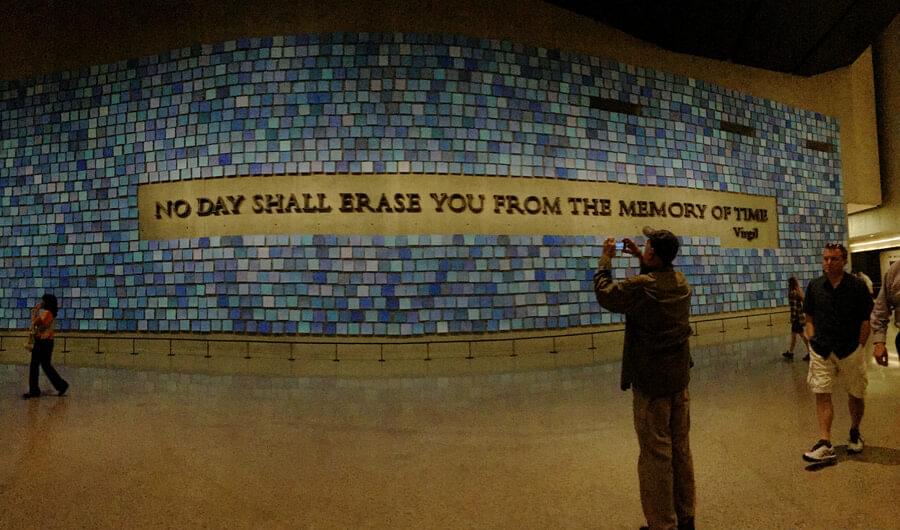
Earlier this year I visited the National September 11 Memorial & Museum in New York City. The museum is built on and around the footprints of the twin towers. The box beams still embedded in the concrete foundations of both buildings are part of the exhibits. Visitors literally walk through the very space where the buildings collapsed, where so many died.
It’s a singularly moving experience. But to be there is also discordant. I was sitting on a bench in the main gallery, a bench of dark, fine-grained walnut like one that can be found in almost any museum in the world. As on that street back in Boston, around me scenes of calm domesticity played out.
Bored teens. Parents with strollers. People snapping photos. In short, it’s not unlike any museum anywhere even though it’s hallowed ground unlike any other place.
I bring all this up in light of the Paris attacks and how easily the calm of the world can be turned to chaos and horror and then back to calm.
We mourn the victims, we honor them. But also life resets to its normal state. Basic simple goodness and decency wins out.
But we’ll always remember that something terrible happened here.
I remember the first time I saw someone using a giant phone. One of those really oversized Samsung phones.
It looked silly, as if the person was holding an iPad Mini against their head to make a call. Who wants to look silly?
Not me. I had my iPhone.
When the iPhone debuted in 2007, it was the thinnest, smallest smartphone available. In typical Apple fashion, they had designed a phone years ahead of others in capability and then made it impossibly small. 1
Some of bulkiness of their competitors was due to limitations of the era. Miniaturization is costly and hard, but then again, the players extant at the time hadn’t really pushed the boundaries either.
But by making the phone so small Apple wasn’t just showing off. It was pursuing a design goal. That iPhone was made to be used one handed. The 4.3 inch screen was roughly the arc of an adult thumb if the phone was held in a choke-down grip.
Phones are stowed in pockets. Smallness also helps handling the device in general especially for women, who on average have smaller hands than men.
For all these reason, people who prefer small phones aren’t wrong. Small is a good design choice. Or it would be if user needs never change.
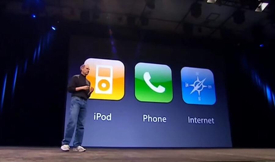
Steve Jobs famously introduced the iPhone as three devices: a widescreen iPod with touch controls, a revolutionary mobile phone and a breakthrough Internet communications device.
However, if one were to rank those “three devices” by importance now, the phone and iPod aspects are barely worth mentioning, basically table stakes for any phone maker. Phones now are best defined by the third aspect, but even that doesn’t even really apply any more. They are a “magic pocket computer”.
The iPhone – or phone of any kind – is a device that must serve changed user priorities. It’s a reading device. People write on it. People shop on it. People find dates on it. For a growing number of people, it’s their only computer.
And it’s become an app driven device, unlike that first iPhone that shipped with a mere 15 apps and no App Store. The phone is a general purpose computing device in the way a desktop machine was during the Windows 95 era. It’s a platform in the truest sense, not just a device.
Apple, pioneer that they were in the mobile space, was slow to build a device to jump on this trend.
Apple tends to have a “we know best” attitude concerning UX matters. It’s not surprising that Apple stuck by its initial design choices through four generations 2 even as terrible phones like the Galaxy S series caught on mainly for their larger size.
Easier handling, pocketability and on-screen reachability pale next to better overall usability of a larger device.
I realized this recently when I had to test a site on an iPhone 5. Everything seemed impossibly tiny. Typing on the cramped keyboard was difficult. Really, it was just harder to use for almost everything. Getting a site to scale down to 320px width made me realize the usability sacrifices we designers make to accomplish this.
So much more can be done on a larger device. The overall UX for task completion and general comfort is even better with the plus-sized device than the regular 6. I’m writing and editing this blog post on my iPhone 6 Plus, for instance.
Getting a larger phone wasn’t all good. The iPhone 6 had all the shortcomings of a larger device – and more. Some were made worse by the design, with its rounded corners and smooth aluminum back.
It was like holding a bar of soap. I always felt like I was on the verge of dropping it, a feeling that led me to put my phone in a case just to make it more grippy. 3
I switched this year from a 6 to a 6s Plus based on the theory that if I was going to be fumbling my phone anyway, I may as well be fumbling one with an even bigger screen.
Sizing up my phone has made me reflect on one of the basic tenets of the design practice: Design is about making choices. Also, sometimes it’s about revisiting choices.
Structures are built with intent. The architect makes decisions based on this intent – where does the entryway go? Where are the stairs? What does it look like?
Yet, the life of the building changes. The office I work out of was originally built as a warehouse for an industrial part of town. The architect couldn’t have foreseen that it would someday be an office in the magical future year of 2015.
But UX design need not be as constrained as brick and mortar. It must be ephemeral, changeable. It’s based on context. It’s based on emotion. It’s based on shifting outlook and needs.
Keeping up with changing needs is central to the practice. Sometimes that means throwing out core concepts we have clung to for years.
Sometimes we have to go big even if it does look kind of silly.
I still have my original iPhone. It feels small now, but for different reasons.
The iPhone 6 is actually the fifth-generation iPhone as there was no iPhone 2.
I’m not sure what Apple did, but the iPhone 6s is significantly more grippy. It’s noticeable when holding a 6 in one hand a 6s in the other.
On a lovely early fall day in 1992, I was walking across campus.
It was move-in day at Eastern Illinois University. I’d just unloaded my meager possessions from the back of my aging beige hatchback and was wandering around taking in the sights.
The day was warm and the leaves had not yet started to change. Dozens of students were wandering around. Families were disgorging belongings from the backs of minivans and trucks.
Posters and fliers covered buildings and bulletin boards. The ‘92 election was a couple months away, so Bill Clinton placards were up all over.
The opening notes of U2’s Zoo Station blasted from an apartment window as I passed. It felt so much like college, bustling and alive.
A thought – actually more of a feeling – hit me. It was as if the world stopped and had snap-zoomed in on me. I realized what the moment actually meant for me.
“I can’t believe that I’m actually here.”
For many people, college was normal or even expected. Not so for me.
I came from a lower middle class family. The people I grew up with weren’t really on the college track. For many childhood friends getting a job on the line at Caterpillar was the ultimate goal.
But from a young age I knew I didn’t want that. But I didn’t know what I wanted. So far I’d been a day laborer, a warehouse worker, a janitor. Nothing inspiring.
By 1992 I had been getting my life on track. I’d done two years of junior college, and even though I’d been accepted at Eastern I had no money.
I spent the summer going through the motions of a person headed off to school in the fall, but with a sense of doom. I filled out the forms for housing and picked my classes, fearing that in September I’d be staying home.
My funk deepened as fall approached.
Then, seemingly at the last minute, everything fell into place, almost improbably. A grant came through. I got a tuition waiver. My brother helped me earn some money. I ran the numbers. I had enough, just.
I was going to college, or more accurately I was now finally at college. I was really there.
It was unbelievable. It was one of the few “pinch me I must be dreaming” moments I’ve ever had. I’ve never forgotten that moment and what it has meant to my life.
This weekend I traveled back in time.
The Daily Eastern News, the student newspaper at Eastern, celebrated its 100th anniversary. Myself and dozens of other former DEN staffers returned to campus to celebrate and catch up on the two decades that have passed.
Once again I found myself walking across the Eastern Illinois University campus on a lovely fall day, with crisp temperatures and a clear blue sky. Again I was swept up in the feeling of “I can’t believe I’m here.”
But this time it wasn’t awe. It was more a sense that I was finally back at a place I longed to visit but never really had the opportunity. I don’t get to rural Illinois that often.
I was wandering about looking at the campus, doing selfies in front of buildings and feeling a swell of nostalgia.
I heard a shout, “Hey, Putney.”
It was a couple of my old Daily Eastern News chums. Within minutes we ran into a couple more. A few minutes after that we were sitting around a table at Marty’s, one of our long-ago haunts. Gone was the dark, cavelike decor. Bright sunlight streamed in the windows.
I was back. I was really back.
When I think about the Daily Eastern News and what it did for me, it seems impossible to sum up.
Yet, somehow seeing everyone this weekend makes it easier to take measure, as if things have a start and endpoint now. One stage of life can be compared with another.
Our 20’s and early 30s are about getting somewhere. It’s about acquiring the trappings of adulthood. Earning your place. Paying your dues. Getting ahead. Building a life. Looking forward. New, new, new.
The late 30s and 40s are about being somewhere. This is my house. This is who I am married to. These are my kids. This is my career. This is my life. This, this, this.
The last time I saw my DEN colleagues we were in our early 20s. We were passing one major life milestone – graduation – and headed to another: first job. Everything seemed possible. Now, the future seems a bit smaller, the past much larger.
At the opening reception I wended my way through the crowd searching for people who looked roughly my age and vaguely familiar. There was laughter at the recognition.
I was suddenly back in the old days.
Back in the DEN newsroom, a lovable, beat-up old thing that produced some of the best college journalism in the state. The ragged, stained orange carpet was salvaged from the student union. Furniture, likewise, was intercepted on its way to the dump and delivered to the DEN.
The newsroom, literally one-half of a former middle school gym that still hosted basketball games and ROTC drills on the other half, was freezing in winter and sweltering in the summer. The press, a Goss the size of a semi truck and louder than one, was at the back of the newsroom. Working late in the newsroom meant getting to feel the press shake the whole room.
“Can you believe they let us smoke in the press room?” one of my former colleagues marveled during the commemorative dinner. “There were giant rolls of paper in there. They would have burned for weeks.”
The daily struggle of a small staff trying to get the paper out every day in this run-down office bonded us. We were in it together.
Everything flooded back. Memories. Late nights in the newsroom. The fights. The crushes.
At least two dozen of the core group from the ‘92-‘96 DEN were there. The cool kids and the uncool. The “two Chrises” – Seper and Sundheim – were there. Probably outside of the faculty, they had the biggest influence on me, if only because I wanted to be as good as they were. I never was, though.
We sat at a table toward the end of the night and talked about life, work, disappointments. Life often doesn’t turn out like you’d hoped, but most often it still turns out.
“How did we get this old?”
“I don’t know.”
The conversations of the evening could be summed up as this: Where are you now? How did you get there?
It’s the kind of Big Chill-esque conversations people have after getting back together after 20 years. There were a few surprises, such as who turned out to be gay. 1 It wasn’t really a prurient thing so much as people finally getting to say what couldn’t be said 20 years ago.
A show of hands of how many people were still in journalism would likely have been quite revealing.
In the days since, I’ve been trying to think about the reunion, to find a way to really understand it, fit it into my life experience. I keep returning to the campus itself.
Upon my return, I pointed my rental car directly toward Buzzard Hall,2 which housed and still houses the DEN newsroom. I’d driven there dozens, hundreds even, of times while attending Eastern. It’s the first right turn past Old Main. 3
This time, however, I confronted the fact someone had constructed a building across the road mid-block.
As I wandered campus the weekend I saw more changes. Buzzard itself has been renovated, as has Booth Library, whose decrepit stacks once looked like a setting for a slasher movie.
Both were lovely modern facilities now.
My freshman dorm, located far out on the edge of campus across a grassy lot dubbed “The Tundra,” was closed. Signs in the darkened windows warned me away. The Tundra was now a parking lot and tennis and basketball courts.
Everywhere I looked was something familiar, something that pulled me back to my past. Yet, change was everywhere. Same, yet different.
It’s as if my time at Eastern and my time since has been written on the landscape.
Universities need to do a “who turned out to be gay” special edition of their alumni magazines.
When I gave people the address of the building I always used to say “Buzzard, as in journalists circling like …”
It’s building shown above, with the idiot in front of it.
Some time this week, some items changed in a database that controls Internet domains and this site quietly made a major technical shift.
It all went well enough that probably no one really noticed a difference. I did take the opportunity to make a few design tweaks here and there that some might notice. But the change to the site is all on the back end.
I’m calling this version Davidputney.com Snow Leopard.
For about the last 10 years, my site has been published using Movable Type. It did its job quietly and competently, but as a technology it badly dated and therefore was deeply uncool.
At the time I chose it, which publishing platform to embrace wasn’t quite so clear as it is now. A nascent blogger really had to choose between WordPress and Movable Type. I went with Movable Type. And, well …
In some ways I did make the right choice. Movable Type is dead simple compared with WordPress and its hideous PHP-based templates. As time went on, I knew Movable Type so well that I could build sites extremely quickly and efficiently in it.1
But it was also becoming clear years ago that I needed to switch. Key plugins were four and five years old, and new ones were not being written. Googling for answers when I encountered a problem would often turn up nothing.
I needed to build my site on something with an active community. My choice was – not WordPress. Rather, I went with Jekyll.
For those non-technically inclined who have stayed with me this far, Jekyll is a static site generator, which means that, unlike WordPress, it doesn’t require a database and other elaborate server-side software to create and publish a site. Or to maintain.
And, unlike WordPress, if a static site gets hit with a heavy server load, it won’t melt down like Chernobyl. If Drudge Report wants to link to us, all we have to say is “Come at me, bro.” 2
And, from my own perspective, I no longer have to run a local web server, MySQL database and other complicated stuff on my laptop to update my site. With a simpler dev environment, it’s easier for me to build items for the site.
The best news is that because of this switch, readers have a whole new way to enjoy Davidputneycom!
The source code for the entire site, including all posts, is on Github.
Readers comfortable with a Unix command line,3 need only do a git clone on the repo, install the dependencies – Node, NPM, Gulp, LibSass, Homebrew, ImageMagick, Jekyll, etc – do a quick compile and they will have their very own version of this site running on their computer for their offline reading convenience. Yes, it’s just that simple!
For a while we considered making this easy, convenient, fun method the only way to enjoy the site, but this is a mobile first world and the command line options for iOS are fairly poor right now. If someone can find a decent command line Git client for iPhone let us know so we can hopefully pull the trigger on this option soon.
Or, if folks want a full Davidputney.com experience, they can pull the repo and use it to run their own guerrilla version of Davidputney.com on their own domain. All we ask is that they not attempt to assume our identity by murdering us and wearing our skin like a suit, Edward Gein style.
The visible changes are few, but you will still see some differences:
The pages begin rendering twice as fast as the previous version of the site, in just about a half second in optimal conditions.
To save bandwidth on mobile, we are now lazyloading our responsive images using Lazysizes.
We cleaned up the underlines on hyperlinks.
We tweaked some key animations to make them better.
We fixed a glitch that was causing fonts to redownload with some page loads.
We fixed other glitches that were slowing page rendering a bit.
The blog is now paginated.
We added photos onto the blog front and subsequent pages.
We cleaned up some of our URLs. For example portfolio items now reside at davidputney.com/design rather than davidputney.com/archive/projects.html
But, as Vincent said in Pulp Fiction, it’s the little differences. Eventually they start to add up.
This version of my site was built and launched a year ago with (then) job hunting in mind. I needed to build it fast and not get bogged down in learning WordPress too.
He will, however, quickly run through our bandwidth allotment.
When watching a movie, most people just assume things.
We automatically go with the movie’s morality. We side with characters that the directors and writers want us to side with. They go out of their way to stack the deck against the bad guy or gal.
Sometimes they do it by playing to ugly prejudices. Physical deformities, foreigners or a swishy male villain are particular go-to favorites. They certainly always make sure the bad guy is seen doing evil things.
But if you strip away all this artifice and set-dressing and off-the-shelf moral cues, one might find a different story. For instance: The Wizard of Oz.
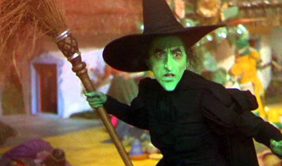
I’ve long argued that The Wicked Witch of the West is the movie’s only postmodern character. Played by the great Margaret Hamilton, who later wrote the software for the Apollo moon landing, she’s the only one in the movie who realizes she’s an archetype – a wicked witch.
While the others in the film are also archetypes, they don’t make note of that fact. They choose not to refer to themselves as the “naive common-sense farmgirl” or “rustic farmhand,” or “gay stereotype tin woodsman” or “gay stereotype lion” or “gay stereotype scarecrow” or, well, “gay stereotype fake wizard.”
Repeatedly declaring oneself wicked is itself a bold claim. It’s central to her personal branding efforts, but it seems to be mere affectation. The film lacks strong evidence of actual wickedness from either her or her sister, the Wicked Witch of the East.
The latter, unseen except for her feet, is infamous for her control over Munchkinland and its residents, yet consider these facts:
Residents of Munchkin Land are nicely-dressed, healthy and well-fed.
Municipal government persists, both on the local and county level with a clear chain of power to a central authority as evidenced by the statement “As the mayor of the Munchkin City, in the County of the land of Oz.”
Rule of law remains important, as the Wicked Witch of the East is subjected to a coroner’s inquest – albeit a hasty one – before officially being declared “not only merely dead but really most sincerely dead” and the proper paperwork filed.
Unionization is allowed and presumedly encouraged, as a group of candy industry workers representing the local chapter of the Lollipop Guild are given space and time on the celebratory dias.
Vibrant, officially recognized civic organizations also exist, such as the local branch of the Lullaby League that is given welcome wagon duties.
Arts and humanities have flourished, allowing the Munchkins to mount a lavish, spontaneous song-and-dance medley that lasts several minutes and encompasses the entire village and all its residents.
While it’s possible Munchkin City is a North Korea-style Potemkin Village, nothing in the movie overtly shows or even hints at this. The only details of her “evil” reign are vague accounts in the Munchkins’ songs, and we all know history is written by the victors.
We are left to conclude that the Wicked Witch of the East was at worst a benevolent dictator in the Roman Empire model. Yes, Munchkinland did likely undergo conquest in the recent past and an occasional pogrom to tamp down dissent, but the witch was otherwise laissez faire as long as proper tribute and deference was paid.1
The sketchy circumstances surrounding her offscreen death only lead to further fears of conspiracy and coverup. The Dorothy and Munchkins’ inconsistent accounts of the event raise more questions.
Why would a powerful witch with a magic broom and imperialistic ambitions be thumbing for a hitch? And what was she doing in the middle of a ditch in the first place? Was she lured there to be assassinated?
More importantly, how could Dorothy have witnessed any of this?
The geopolitical picture doesn’t get much clearer once the plot machinations kick in. The movie is built on two central conflicts that Dorothy doesn’t understand yet inserts herself into anyway.
The dispute of over ownership of the Ruby slippers.
A political dispute between the Wizard in Emerald City and the Wicked Witch who controls the western provinces of Oz.
Most of the Witch’s “wicked” actions actually are driven by Dorothy’s poor choices or ill-considered alliances in resolving these conflicts.
Early on, Dorothy shows little to no remorse over the death of the Wicked Witch of the East.
She is seen dancing and celebrating at the crime scene when the Wicked Witch of the West arrives to mourn her lost sibling and collect her belongings. The witch is confronted by this horrifying revelry overseen by Glinda – who couldn’t be bothered to help the Munchkins during their oppression yet shows up to take credit and gloat after their release. She rubs the Wicked Witch’s face in it.
She taunts her by claiming the witch has no power there. “Be gone with you, before someone drops a house on you, too.”
Some well-timed contrition on Dorothy’s part might have defused this tense situation but she escalates it by turning it into a probate dispute.
As the Wicked Witch of the East’s sister, the Wicked Witch of the West would clearly stand to inherit the Ruby Slippers, but they end up on the willing feet of Dorothy. 2
This is where it gets tricky. Yes, the witch does threaten to kill Dorothy, but Dorothy put herself into this position. She could have just turned over the slippers or refused to accept them outright. As a result, she finds herself in the firing line.
“No! Fool that I am! I should have remembered! Those slippers will never come off as long as you’re alive,” the Wicked Witch says, awkwardly delivering key exposition about the rules of the Oz universe.
This scene makes it clear that once Dorothy accepted the stolen property she sealed her fate. The rules governing ownership of magical shoes are often harsh, but they are what they are. The only way to ensure their lawful and correct return was her death.
However, the dispute over shoes ignores an even more important factor in the escalating conflict, namely Dorothy’s mission that brought her to the Witch’s castle.
When Dorothy arrives at Emerald City she and her conspirators are immediately swept up in a world of glamour, power and decadence.
The lion, drunk with power, sings a song of a plush life of satin robes (not cotton, not chintz). His song dwells on the absolute authority he will wield as others finally kowtow to his whims once he seizes control of the jungle. Even the trees will bow, he imagines. 3
Without making any effort to examine Oz’s geopolitical and economic situation, Dorothy and her group immediately throw in with the Emerald City central authority.
Although the mission she is sent on is defined as the more innocuous goal of capturing of the Wicked Witch of the West’s broomstick, its true nature could not be clearer. They were to be the Wizard’s personal SEAL Team 6.
And this isn’t just wild supposition about the mission. Outside the Witch’s castle the scarecrow is clearly seen carrying a gun.
One could argue that this kill order was a defensive move on the part of the Wizard. The Witch would clearly kill him should she ever learn he’s a fraud.
But it also seems a power grab on his part, a chance to eliminate yet another a powerful foe. This would reshape the strategic power balance of Oz in a more Emerald City-leaning fashion in both the East and the West. And an easily disavowed third-party would be handling his wetwork.
The Witch has every reason to fear the approach of a Dorothy-led armed strike team. They had already gruesomely killed her sister, leaving her, according to the Munchkins’ musical account of the incident, to twitch in the throes of death as the house crushed her to a mere stitch.
The Witch’s response, dispatching an army of flying monkeys to capture and detain the kill team, seems much more proportionate and measured than at first glance. She specifically instructs the monkeys that she wants Dorothy “alive and unharmed.”
While Dorothy’s eventual dispatch of the witch via a prolonged, presumedly painful, melting process is certainly excusable as self defense, had the witch been successful she could have made much the same claim about her own actions.
The witch met her end because she acted too cautiously in the face of an existential threat. She made the Bond villain mistake of needlessly keeping Dorothy alive or using comically ineffective methods to assassinate her, such as a poppy field that was easily countermanded with careful application of deus ex machina.
Dorothy, on the other hand, saw the bucket of water and acted. History often turns on these types of moments.
The Witch was just a victim of her times, someone caught up in the larger scope of events and unable to navigate them. She died unaware of how she fit in the larger picture, of who was really pulling the levers of power.
It’s like what Lenin4 said. You look for the person who will benefit.
This person was someone who knowingly put Dorothy in danger repeatedly. Someone who lied and manipulated Dorothy to her own ends.
Someone who sent Dorothy out to do her dirty work. Someone who could be barely bothered to intervene in life and death situations she put Dorothy into.
Someone who stood back and played all sides against each other, leading to the deaths of two Wicked Witches and exile of the Wizard. Presented with this power vacuum, that someone now stands to become the most powerful person in all Oz.
Glinda.
Everything she does in the movie is inexcusable. She is, in all ways, a terrible person.
Originally, the movie was to end with Glinda telling Dorothy that she always had the power to go home. “Just click your heels together three times.”
Dorothy would pause for a second recalling her brushes with death, the endless nights longing to see her beloved aunt, the agonizing wait for her execution in the Witch’s castle, the knowledge that she would be haunted forever by screaming faces of the lives she took …
The implications of Glinda’s statement would finally sink in.
Dorothy would then scream “You bitch! You lying whore!” and beat Glinda over the head with a ruby slipper.
We are left to wonder what the aftermath of Dorothy’s killing of the head of state was. Did the mayor undertake a bloody purge of his enemies? Were Wicked Witch collaborators hunted down and dispatched? Was Munchkinland sent into a bloody, prolonged civil war?
No will is mentioned in the context of the film so we are left to assume normal inheritance rules would apply.
Presumedly a lyric about having a castle pool full of sleek, buff rentboy lions was cut because of the Hayes code.
When iOS 9 was announced this spring, the feature that allowed for the creation of ad blockers was barely mentioned, let alone touted as one of its headline features.
Thanks to the Streisand effect, it’s the story of iOS9 launch weekend. Many users are finding out about ad blockers for the first time thanks to the kerfuffle.
Notably, Marco Arment, creator of Instapaper1, introduced Peace, an ad and tracker blocking app based on Ghostery. It quickly shot to the top of the App Store charts despite its $2.99 price.
In a move that will spawn dozens of hot takes2, on Friday afternoon, he pulled it from the App Store, saying on his blog that it didn’t feel right.
He’d been a vocal proponent of ad tracking, but it’s maybe one thing to favor something and another to be the means through which it’s carried out.
Just as Rabbi Krustofsy needed car-buying questions phrased as a moral quandry, some view the decision to use an ad blocker as an ethical question. The choice actually strikes me as a little more realpolitik than moral.
Two things are not in dispute:
The current state of ads and ad tracking create a terrible user experience, bloat page size, slow download speeds and violate privacy.
Publishers have no choice but to use them.
This first point is made clear by Crystal, another popular ad blocker in the app store. It has a simple sales pitch. They just show it in action.
Sites such as The Washington Post and CNET have begun to retaliate by blocking ad blockers. But this doesn’t change the underlying facts or get at the actual problem.
One of the basic tenets of creating a good user experience – whether it’s summoning a taxi with an app, tracking a package online or designing a pair of headphones - is that you don’t shift problems onto users.
They don’t see the boardroom fights or the deadlines or the budget constraints. All they see the final product. That’s all that matters.
But legacy news orgs, who are most often the worst offenders, don’t see it that way. The main consideration is what they can extract. It’s why sites are almost diabolical in implementing bad UX.
It’s not unusual to follow a link from social, get somewhere into the second paragaph of the story and have a paywall or takeover ad slam down like a castle portcullis.
Here’s a short video that sums up many readers’ feelings on takeover ads, Taboola and privacy violating ad trackers.
But, there’s no nice way to put it. If ad blocking on mobile becomes popular or the norm, legacy news orgs are completely screwed.
There’s no “whatever doesn’t kill us only makes us stronger” happy face to put on it.
Financially, legacy news orgs have nowhere left to go. The old business model is going and is nearly gone. The new model isn’t working, and paywalls as a savior are proving to be a pipe dream.3
But it’s not just money woes that are dragging publishing down.
Publishers’ ability to innovate is in a quite literal way hemmed in by orgs themselves. The news business model was disrupted by the internet, but what is often overlooked is that news culture was also disrupted along with it.
Yet even as the business side tries to adapt, the cultural side hasn’t. It’s openly resistant to the idea despite the fact that they two are inextricably linked
For most of the postwar era, print publications and magazines were a license to print money. Margins of 25 to 30 percent were typical.
With this came freedom of news coverage apart from financial considerations. A certain disdain or even hostility for these business interests took hold in newsrooms, even as such interests were making large, journalistically independent newsrooms possible.
But last-century’s newsrooms are a type of business that literally can’t exist any more. The world has changed.
It used to be really hard to publish. Anyone could buy desks and typwriters and hire a bunch of reporters in fedoras. But news organizations were also light manufacturing.
I could get up from my desk in The Boston Globe’s digital department walk down the hallway 30 feet and suddenly find myself in a factory – with a pressroom, robots hauling giant paper rolls, etc.
The “you have to own a factory” aspect gave them a near monopoly on mass distribution to local audiences and they could set ad rates – both display and classified – accordingly. This barrier to entry is what the internet disrupted, not the paid subscription model.
What was once a feudal estate with carefully demarcated borders and neatly trimmed lawns is now like Max Yasgur’s farm during Woodstock.
The new business model is Crazy Eddie’s Discount Mattress Outlet in the local strip mall. They deal in volume. Ads go for pennies on the dollar compared with print. Stories must get millions of clicks.
It’s a business built on going viral. The 1,500-word story about school board members yawning through a meeting is no longer financially viable.
Stuck with a newsroom that won’t downsize or reorganize into a modern online publication, what else is a news org business manager to do?
News orgs have no secret business plan sitting on a shelf somewhere waiting to be dusted off to save the day. Quite simply, the news business has always been supported by ads, and ads can no longer support it in its previous form.
If those ads are blocked, there’s no alternative.
Perhaps if publishers had given users a simple opt-out on tracking they wouldn’t be finding users wanting to burn the entire village to the ground and sow the land with salt.
Publishers can say “if we weren’t in this trouble …” or “if we could just have more time …” or “if we could find some other funding …”
“You aaaarre, Blanche. You aaaaarrrre in that chair.”
And is that the situation they must now live with.
Which also strips out ads, by the way.
Guilty
Genie-back-in-the-bottle moves like paywalls have huge appeal inside newsrooms. It’s an attempt to bundle up readers so that news orgs can claim some sort of exclusive access to them and charge more.
Even as Sam Smith rustles through Tom Petty’s back catalog looking for a melody for his new Bond tune, we take a look back at 50 years of songs from the venerable film series. We’re just going to be honest here that this list is so authoritative and complete that it’s the only one you will ever need.
The best
Goldfinger (1964) The gold standard1 for themes. Sweeping, sultry and backed by urgent jazz orchestra horns and quotes from the iconic Bond theme. This John Barry song is not just a Bond theme it is the Bond theme. It defines an entire genre. Its close association with the film and Dame Shirley Bassey’s iconic performance has kept it from becoming a standard, but it’s among the great movie songs of all time. It also casts a long enough shadow that attempts to match it have led to a string of dreary copies and retreads.
Dr. No (1962) It’s borderline cheating to rank this one. In a literal sense this is just the Bond theme everyone knows and has heard dozens of times. Duh duh duh-duh, da da duh - the seven notes that denote Bond told with blaring horns and guitar jangle. Is this song venerable because it’s great or great because it’s venerable? It’s inextricably tangled with the series. Hard to know for sure. One thing is sure, it’s as recognizible as the Star Wars theme and just as perfect. Any Bond fan hearing this can’t help but get excited.
Nobody Does it Better (1988) The best of the pop-song Bond themes is sung by Carly Simon with just right mix of sexy and smart. The winking innuendo – nobody does what better? – in lesser hands would have been kitsch. But Simon seems almost sensible here. It was penned by Marvin Hamlisch, whose pop songs come across like a poor man’s Burt Bacharach. He tended toward cloying and saccharine tunes, eg. The Way We Were, but this is a perfect soundtrack and AM radio hit for the wide-lapels-and-polyester decadence of the Roger Moore-era Bond.
From Russia With Love (1963) John Barry’s jazz orchestra Bond scores are among the most iconic film scores of all time. This theme doesn’t manage quite the syncopated urgency of Lalo Schifrin’s 5/4 Mission Impossible theme, but its easy to picture Schifrin trying to match this theme when writing his. There’s something grand in its scope, even as it captured the nervous energy and adventure of the nascent franchise. This was the last of the instrumental themes and it exudes the type of ’60s Bond cool that made the film series so popular.
All Time High (1983) This is the best “big” non-Bassey sung theme. It’s cut from the same cloth as Nobody Does it Better but the simpler pop arrangement lets Rita Coolidge’s vocals soar. It doesn’t have the juvenile double entendres of the best Bond themes; its lyrics are more like a straight-ahead love song. All the better for radio hitmaking. Coolidge doesn’t have Bassey’s authoritative presence, but she strikes the right tone nonetheless. Unfortunately it opened the dreadful Octopussy, which includes, among other things, an aging James Bond in a clown costume.
Skyfall (2012) Adelle’s soaring sandpapery vocals are strong enough to credibly front an orchestra, a key to this song’s strength. It sounds properly grandiose. She’s expansive without straining, especially in the coda. Skyfall was the first Bond theme in decades to capture the feel, that intangible je ne sais quoi, that makes a great, timeless Bond theme. However, like the movie itself, Skyfall is actually something fundamentally middling made better with proper production gloss.2 After a dozen listens it becomes somewhat plodding and repetitive, but it never stops being a spot-on Bond tune. Although the lyrics left listeners wondering if Adelle was willing to let the sky fall or not 3.
Diamonds are Forever (1971) Like Skyfall, this is not a particularly good song. Its PG-13 lyrics about suggestively fingering diamonds and how they “stimulate and tease me” maybe try a little too hard to be seductive. But the great Shirley Bassey, returning for another Bond outing, somehow sells it. She doesn’t soar as on Goldfinger, but she captures the subleties better than Nancy Sinatra on the similar You Only Live Twice.
Another Way to Die (2008) Jack White is the most potent rock-and-roller in a generation. In Seven Nation Army he turned a single riff into a shack-shaking, blistering rock anthem. Compared with most Bond themes, this straight-ahead rocker is enough to blow audiences hair back. However, the song itself ranks in the bottom half of White’s overall cannon. The horn-heavy arrangement tries to wed the Bond jazz orchestra style with White’s, but it leaves his guitar hanging on a hook in the cloak room. The horn-filled bridge is crying out for some Jack White guitar fire. Still, it’s among the strongest themes, and the Aston Martin car chase leading straight into this title track delivers one of the most bracing one-two punch openings of any Bond movie.
Sorta
Thunderball (1965) This theme treads the same territory of orchestral jazz horns and Bond theme quotes as Goldfinger – it’s pastiche, to be honest, but still a good one. Sir Tom Jones’ phrasing and delivery come across almost as if someone autotuned Shirley Bassey down a few registers and gave her a Welsh accent. He ends the song by holding the note for the lyric “thunderBALLLLLLLLL” to epic “he loves GOOOOOOOOOOOOLLLLLLD” length. What the song lacks in originality it makes up in verve. This theme could have gone in a really different direction, though. Johhny Cash wrote and recorded a title song for the film that was scrapped. Seriously.
Live and Let Die (1973) Part of me wants to really like this song despite misgivings. It’s the first true rock-‘n’-roll Bond theme and opened Roger Moore’s first Bond film. But this is also Paul McCartney giving into his unrestrained silly pop song tendencies. John Lennon must have hated this song. But even McCartney in his Wings-era worst farting out a pop song is still pretty good. The song serves as something of the missing link between sweeping ballads like The Long and Winding Road and cartoonish nonsense like Uncle Albert/Admiral Halsey. Macca can pull it off, just. To his credit, it is genuinely unique as Bond themes go. But the lyric “In this ever-changing world in which we’re living”, often misheard as “in which we live in,” grates every time it is sung. It’s among the worst lines in all pop music.4 Unfortunately this song is the theme for an irredeemably racist Bond movie with an uncomfortably rapey seduction by Bond of the female lead.
For Your Eyes Only (1981) This, along with Nobody Does it Better and All Time High, complete a triumverate of mid-period hit Bond tunes by female pop stars. If anything, Bond producers liked to try to repeat successful formulas. This, however, with its electro-tinged arrangement feels more distant and chilly than the others, and Sheena Easton’s voice has a certain glassy brittleness. The film itself was a spare, simple spy tale, a welcome change from the bloated “James Bond in space” nonsense of Moonraker that preceded it. This overly glossy ’80s pop tune doesn’t really capture that aesthetic, though.
A View to a Kill (1985) Duran Duran likely seemed a brave choice for a Bond Theme. With its horn blasts and tempo shifts, this song in many ways is a dance pop/New Wave take on McCartney’s disjointed theme. The film’s producers scored a big hit with it. It’s the most memorable part of Roger Moore’s last outing as Bond, a film so bland and inept it couldn’t figure out how to turn Christopher Walken into an interesting villain. There’s even a scene where someone is killed by a butterfly. Really. But this song ends up sounding more like a Duran Duran track than a Bond theme, and for that alone it misses greatness.
Goldeneye (1995) After two middling Bond movies that nearly killed the franchise, much was riding on Goldeneye to return the series to earlier glories. (Spoiler alert: It did.) The slinky tune by Bono and the Edge from U2 is sung by then-ascendent Tina Turner, who is at turns sultry and sweeping. But Turner is much stronger than her material, and it never really takes advantage of her big voice like it could. It comes off as more restained and tasteful than a Tina Turner-sung Bond theme ever should.
You Only Live Twice (1967) The chorus has a beguiling melody, to be sure, but the song mostly plods. But the biggest problem is Nancy Sinatra, whose pop star chops find her out of her depth on a torch song lke this.
Not really
You Know My Name (2006) Did someone shoot Chris Cornell with a tranquilizer dart before he recorded this Casino Royale theme? When the movie came out it was the most rock ‘n’ roll of the Bond themes to date, fronted by one of rock’s biggest voices. Such promise. It sets a fresh tone for a rebooted series, but overall the song just never quite takes off. Despite being somewhat clunky, the lyrics nail the film’s Bond aesthetic – “Arm yourself because no-one else here will save you. The odds will betray you.” The line “The coldest blood runs through my veins. You know my name” should be badass rather than limp. This is the opening track to not only my favorite Bond movie, but one of my favorite movies, period. I can’t hear it without thinking of it, so I like it more than it deserves
Writing’s on the Wall (2015) This song wasn’t yet out when this was originally compiled. Here’s our eerily correct predictive review: “They say never write your lead on the way to the ballpark, but I’m going to pre-predict this one nonetheless. If Smith sticks to his ourve of megahit Stay with Me – overwrought, somewhat juvenile emotionalism set to a plodding tempo – its going to be thin gruel. Frankly, Bond would never, ever, ever plead “stay with me.” Ever. If Smith attempts emotional and stylistic grandiosity, it’s going to be a boy trying to be a man. The film’s producers may score an elusive pop hit as they did with Adelle’s Skyfall, but it won’t be a strong Bond track.”
All the Time in the World (1969) Louis Armstrong was a wonderful singer, with the right material. But this theme from On Her Majesty’s Secret Service is a mismatch. He lends some personality to it, but mainly it just drags on and on and on. It never really evokes the tragic irony of Tracey Bond’s death at the hand of Blofeld. (Spoiler alert.) It’s so forgettable that I doubt most Bond fans even remember it exists, like the movie it opens. This kind of thing never happened to the other guy.
Moonraker (1979) EON Productions went back to the Shirley Bassey well one too many times with this one. This was her fourth and final time up, and it’s the worst. Her big voice and silken purr nail the tone – but the material itself is like a blurred copy of a copy of a copy. The movie was filled with similar creative exhaustion, so it’s not a surprise that the theme song was also.
The dregs
The Living Daylights The chart success of quintessential ’80s band Duran Duran’s Bond track no doubt led to the booking of ah-ha – best known for ’80s pop standard Take On Me – for a Bond gig. This likely seemed the surest of sure things. But the tune is as flaccid as the film itself. Unlike Duran Duran, ah-ha’s pop hooks don’t land. The whole thing is overproduced and, to modern ears, outdated without the gauzy retro patina of Duran Duran’s offering.
Never Say Never Again (1983) This unofficial Bond movie brought back Sean Connery for what was essentially a remake of his own movie Thunderball. The film has a bad rep, but it’s actually far better than any competing Roger Moore-era film. The producers are going for something like Rita Coolidge’s All Time High, but sultry vocals by Lani Hall – wait … Who? Oh, Mrs. Herb Alpert – can’t save this theme from slick, vapid ’80s production and wah-wah guitar mediocrity. The movie deserved better. Notably, someone actually went to the trouble to fix it.
The Man With the Golden Gun (1974) This is the worst of the pop torch song Bond themes. The backing arrangement sounds like something from a porn film, and forgotten pop star Lulu strains to sound sexy and seductive but doesn’t even reach the level of coquettish. Bond lyrics are typically vaguely sexy, but these lyrics are hyperliteral, conveying the film’s key exposition much in the same way as the Gilligan’s Island theme song. The movie itself isn’t much better.
Tomorrow Never Dies (1997) Sheryl Crow is all wrong here. This needs soaring vocal acrobatics, but Crow was never a particularly gifted singer. She’s best when a song calls for slightly bored, sardonic detatchment and at her worst when she needs to exude silken sexiness. Like here, for instance. The chorus is so strained it’s almost painful. No amount of production tricks can turn Crow into a torch singer. This is a flat and dull intro for a film that had one of modern Bond movies’ most scenery-chewing bad guys in Jonathan Pryce’s Rupert Murdoch-esque newspaper magnate.
License to Kill (1989) Betcha didn’t even know Gladys Knight sang a Bond tune. This opener for the second of two dismal Timothy Dalton films places the earthy soulfulness of Knight among generic production and a mediocre reimagining of the iconic Goldfinger theme. The video features a tuxedo-clad Knight superimposed on a special effects background with writhing women. It suffers the same fate of dated silliness. The lyrics are borderline stalker. “I’ve got to hold on to your love … Please don’t bet that you’ll ever escape me/ Once I get my sights on you / I got a licence to kill.” The woman can belt a Bond tune, but she should have just stayed home this time.
The World is Not Enough (1999) Garbage is best known for a couple late-90s hits that matched sharp, Nine Inch Nails-lite beats with Shirley Manson’s sultry damaged-girl persona. They never seemed a good pick in the first place and continued the dreary streak of Brosnan-era Bond tunes with this forgettable track. This song strips the band’s persona away in lieu of generic crooning of the song’s title over a leaden rhythm track and backing as exciting as overboiled vegetables. It actually is garbage.
Special place in Bond theme hell
Die Another Day (2002) This film is almost batshit crazy in its awfulness – its the Batman and Robin of Bond films, draped in ridiculous camp and overall silliness (look, it’s an invisible car!) with some of the worst CGI of a modern movie. Like Brosnan and everyone involved here, Madonna5 was past her prime. But she had the cred to recruit French electronica mastermind Mirwas to convey the seductive energy that her own limited, overly mannered vocals can’t. The song is almost bizarre in its wrongness for a Bond movie. But this isn’t Everybody Gets a Trophy Day at the Montessori school, so they get no credit for trying.
So how did we do? Should we have ranked them differently?
If so, let us know what we got wrong by making a website, adding a blog to that site, spending several hours tracking down and listening to all 25 Bond tunes multiple times, spend several more hours writing a blurb about every single song, and spend even more hours editing, rewriting, linking and fact checking each entry.
Then publish your blog entry and send us a link. We might even read it!
See what I did there?
Skyfall, shot by master cinematographer and frequent Coen brothers collaborator Roger Deakins, is a very beautiful looking bad movie.
Yes, she was in favor of the sky falling.
Everybody knows the lyric “I know that I must do what’s right / As sure as Kilimanjaro rises like Olympus above the Serengeti” from Toto’s Africa is the worst ever written.
She also has a cameo in the film as a fencing instructor. She’s so sinewy that she looks like she’s carved out of beef jerky. And to call her performance wooden is to insult trees.