Ship of fools
Sunday, August 16, 2015
Two-minute read
It was supposed to just be a tech revision, a release I’d dubbed Davidputney.com Snow Leopard.
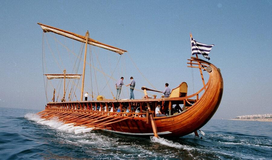
But my penchant for tinkering has once again outrun my good sense. So this site also has a visual refresh, too. In fact, Davidputney.com has been visually refreshed more times than Katherine Helmond in Brazil. it’s more of ship of Theseus in that it isn’t the same site any more.
Here was what it looked like when I launched it last fall. Since then a bunch of it has been rewritten to take advantage of modern browser technologies.1 I’ve changed the fonts several times before settling on Lavenderia and Ginger. I’ve reshuffled the content presentation.
Here’s a quick rundown of the latest changes:
- The header and hero images – the entire top of every page, basically – has been rewritten using flexbox. After wrestling with floats, percentage widths, clearfixes and other layout hacks for the better part of a decade, flexbox feels like a huge improvement. If you are a web dev you should probably learn it, as it will make your life much easier.
- I rewrote all the animations and transitions for these page-topping items. Key among them was a switch to
transform:translate( )to animate positioning of elements. These are aimed at improving performance. - A large CSS refactor that cut out a bunch of orphaned styles and reduced the size of critical path styles embedded in my page headers by a significant amount.
- The site navigation underwent a redesign at mobile widths. It’s larger, 2 but more importantly it has all-new performance sapping, battery-draining, processor hogging, showy and gratuitous animations. So, enjoy!
- Other redesign stuff continues my efforts to strip away artifice that detracts from content. By artifice I mean the ugly shade of tan I used on the site nav/headers for some reason. It’s gone now. You’ll never have to see it there again.
- I switched from embedded SVGs to embedded SVG sprites.
It probably seems bizarre to constantly revise a site that was generally fine to begin with. At least partly this was driven by me transforming the site from a mainly portfolio site into a blogging site. Davidputney.com is also a place for me to try out new techniques and technologies.
The end result is that Theseus’ ship hasn’t just replaced piecemeal, it’s a whole new, better ship.
- Suck it hard, IE users.
- All the better to build my personal brand!